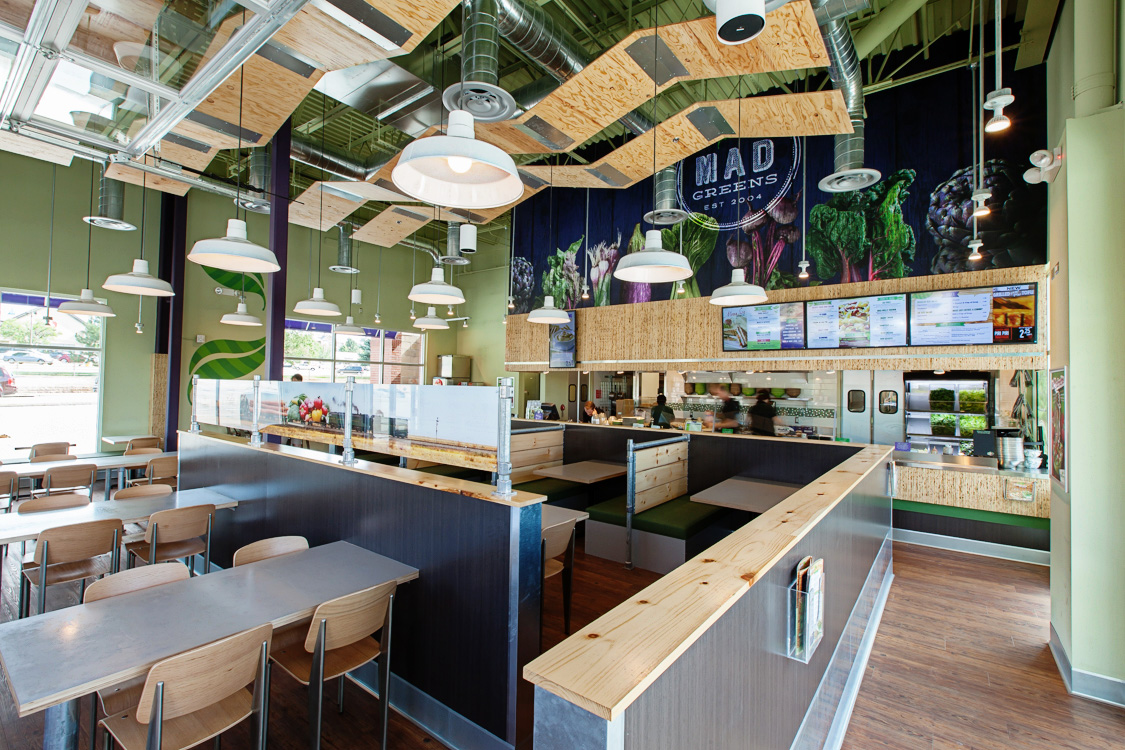
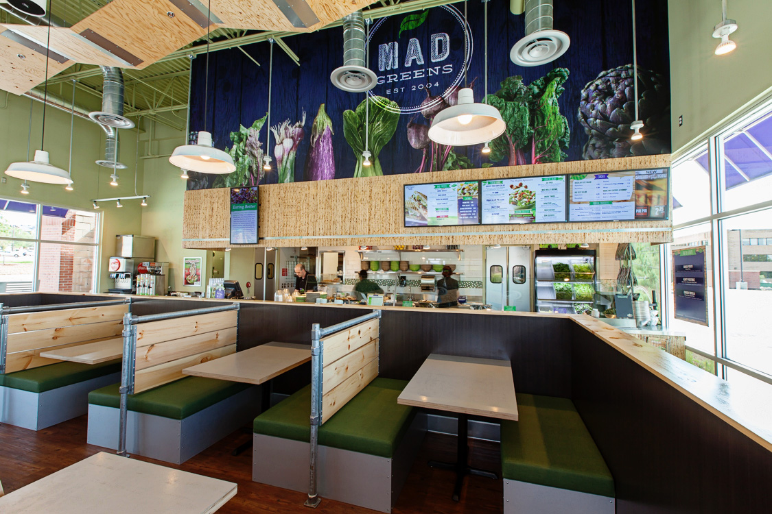
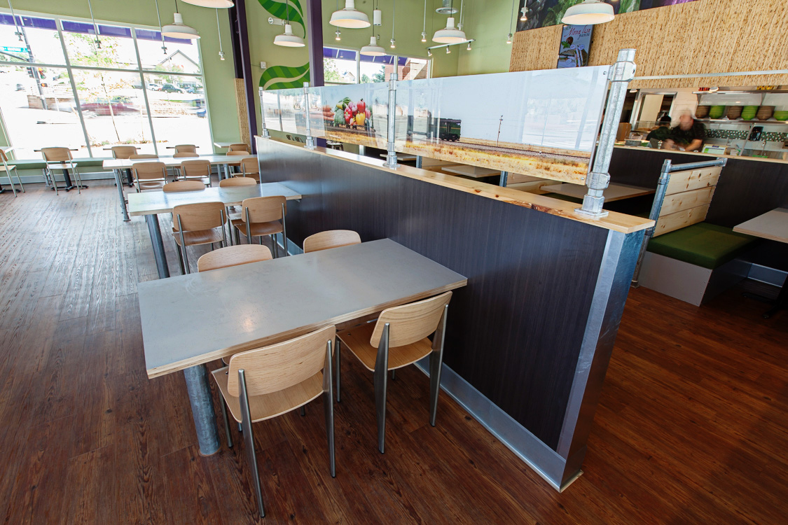
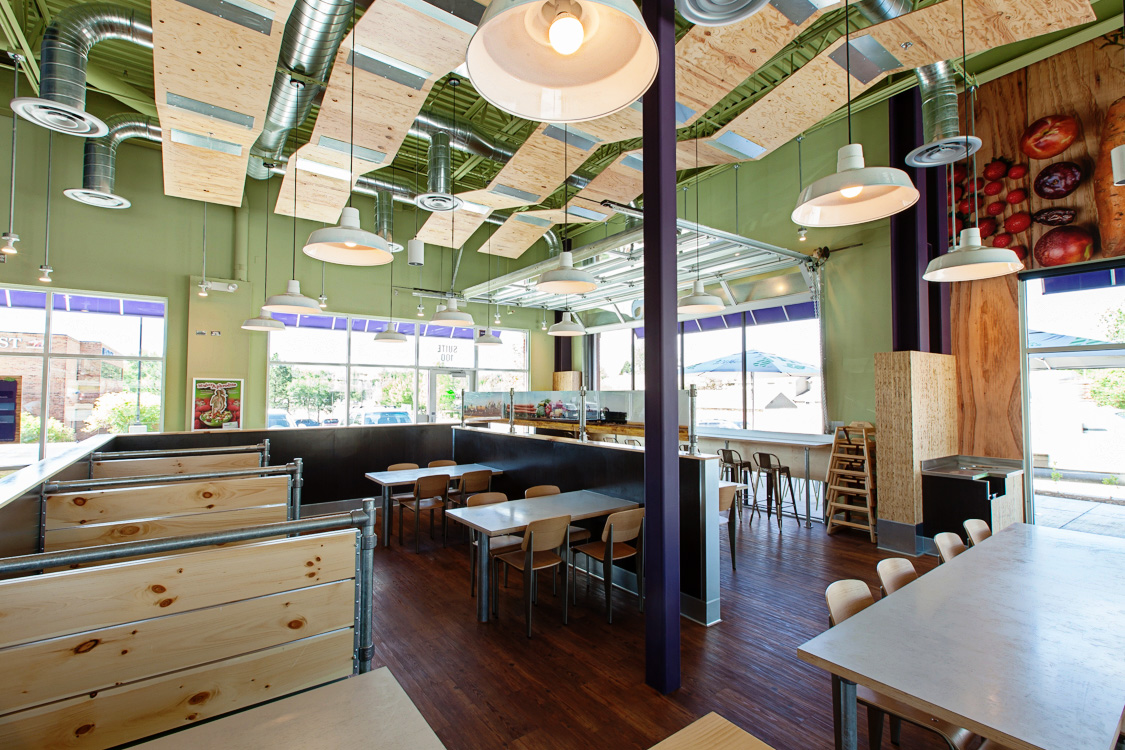
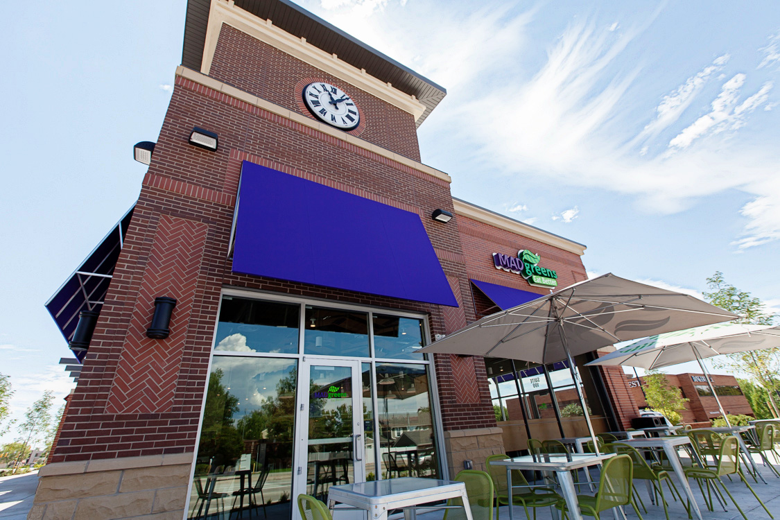
Challenge: create a fast casual restaurant design that better represents Mad Greens’ core brand. The company is dedicated to locally sourced, fresh ingredients, with a playful brand voice. The former spaces were a bit bland and didn’t accurately represent the company’s character. We wanted to respect their success and maintain what they had built in terms of customer loyalty.
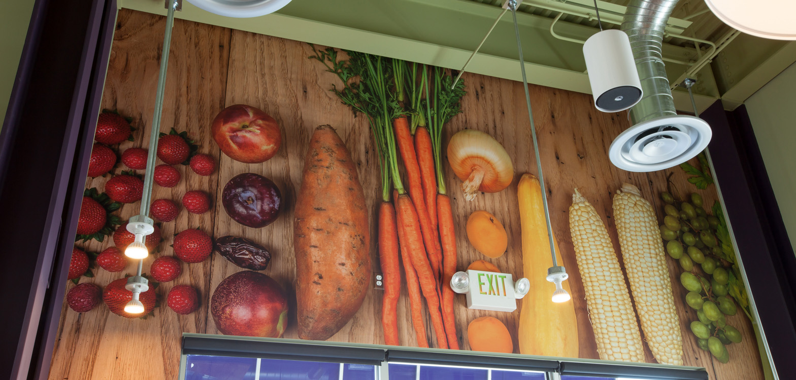
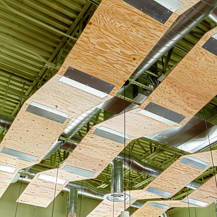
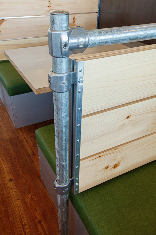
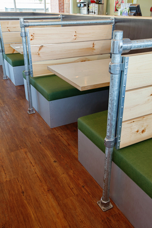
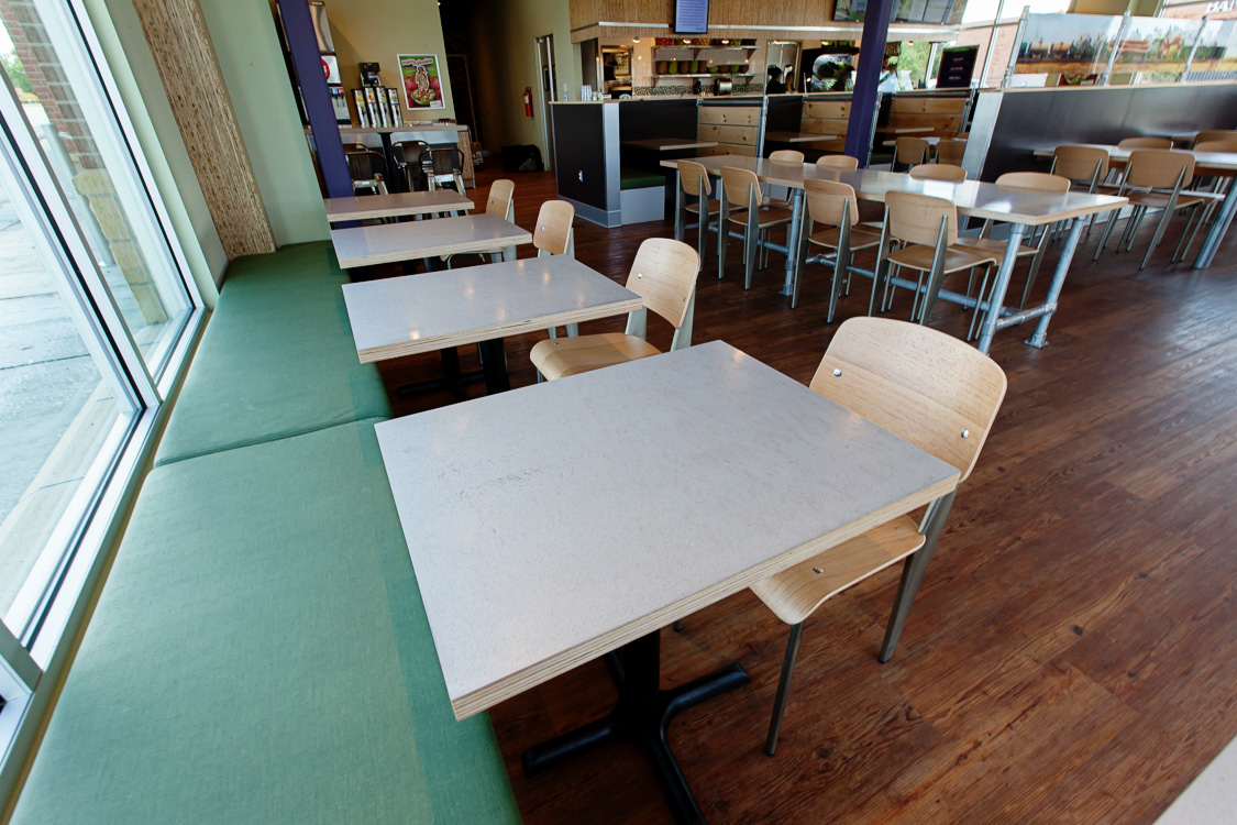
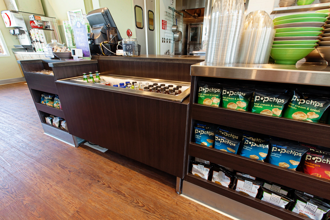
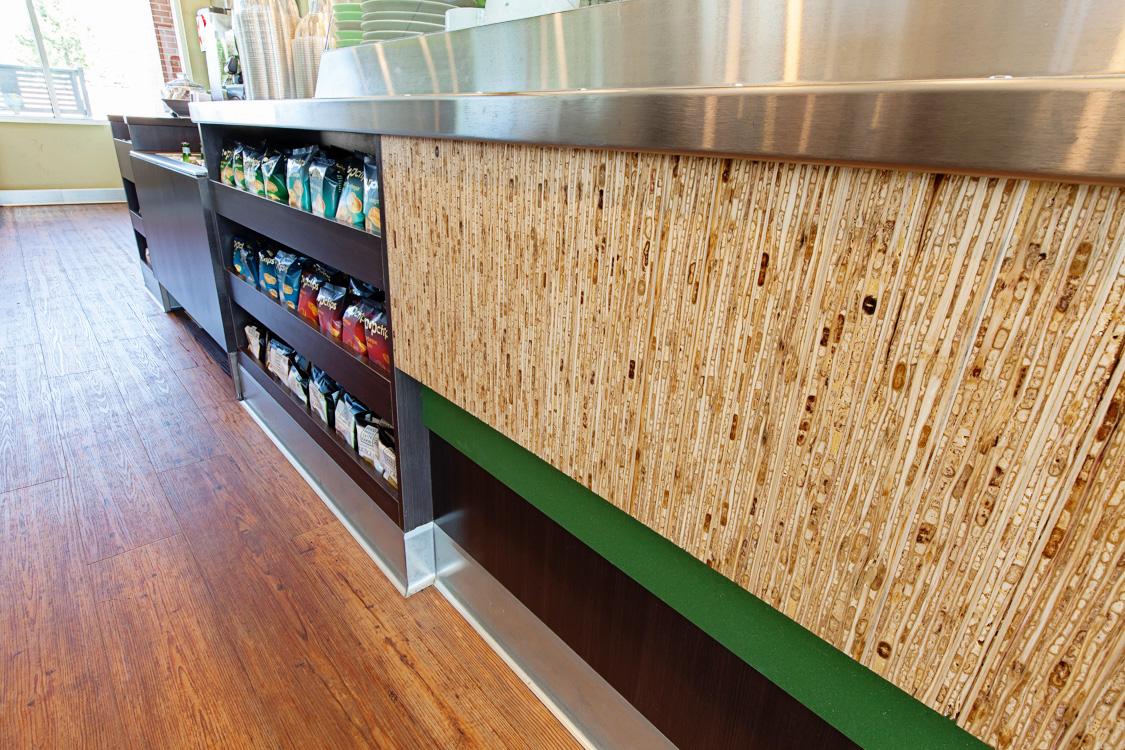
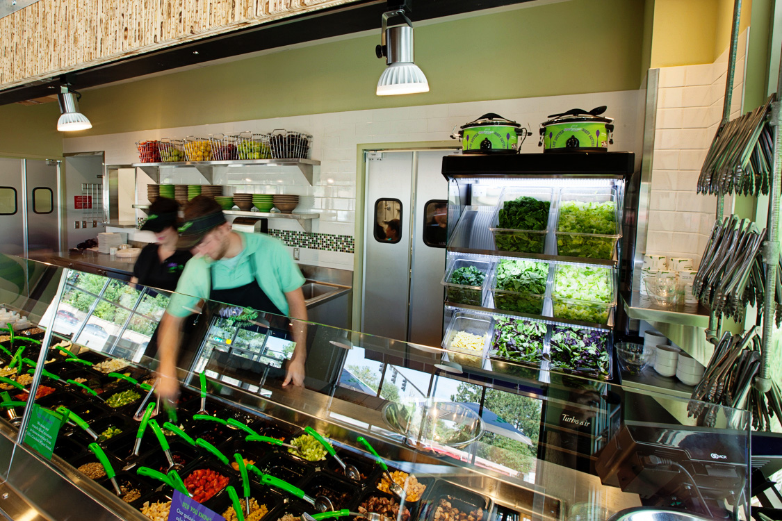
Our design concept introduces natural and industrial materials to reflect the farm fresh vibe. Natural recycled wood, galvanized metal, warehouse lighting, raw finishes, barn style lights and pine wood to evoke crates of fresh vegetables. To make a bolder statement around the Mad Greens message of fresh food, Xan art directed the evolution of the brand to include large scale graphics in the space. This new look for Mad Greens reflects the company’s maturity as a brand.
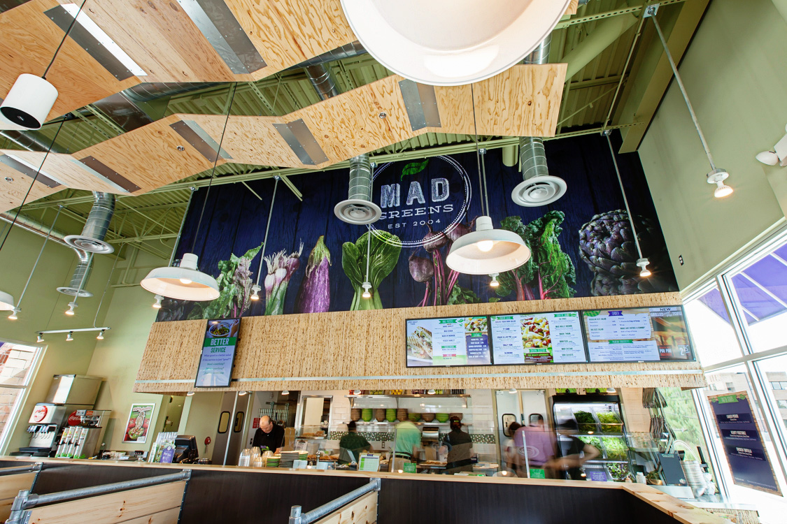

“I know I speak for the entire MG team in saying….awesome job! When Dan and I met Xan the first time, we both felt strongly that they understood what we were after and the vision for the brand refresh we were looking for. Throughout the process that feeling was reinforced and now that we have a finished product, it speaks for itself. The new design really expresses our core values as a company and adds the improved functionality we were looking for. Great job, Xan nailed it!”
— Marley Hodgson
