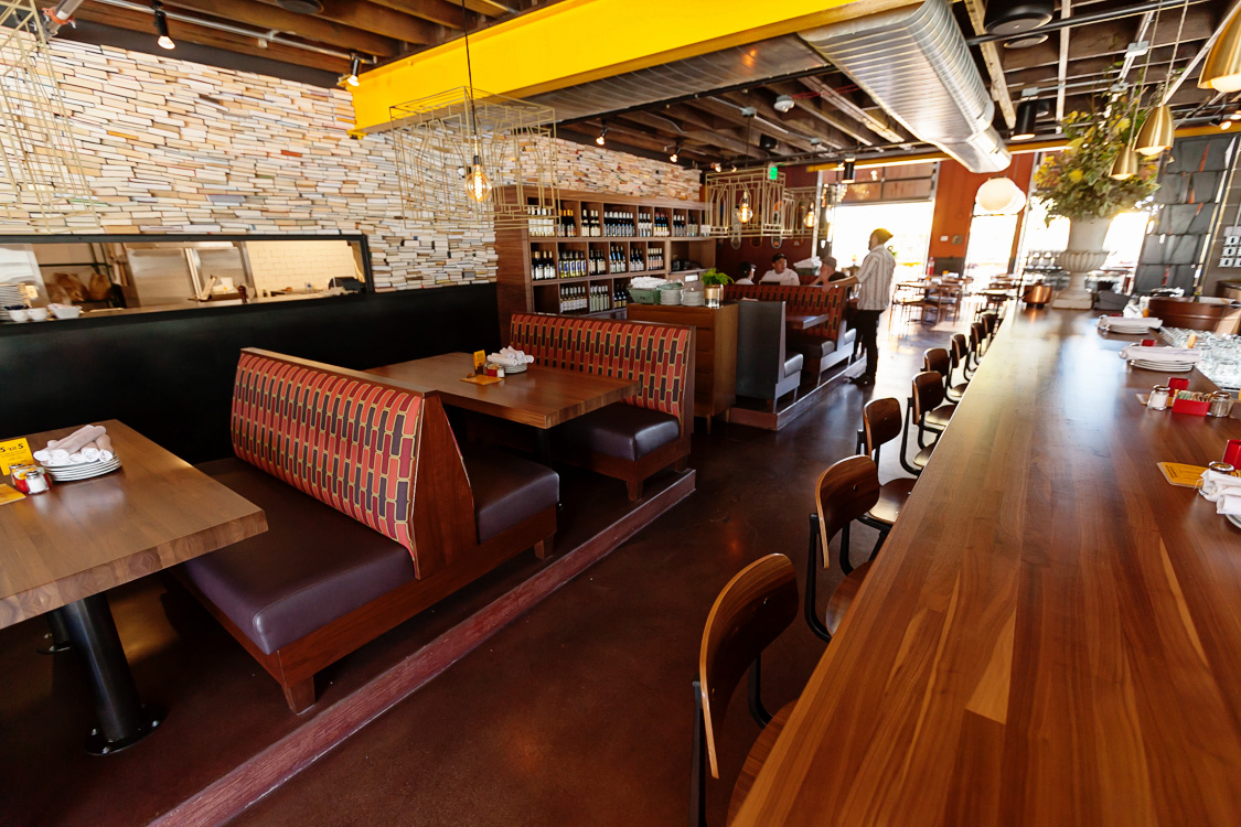
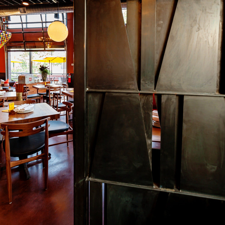
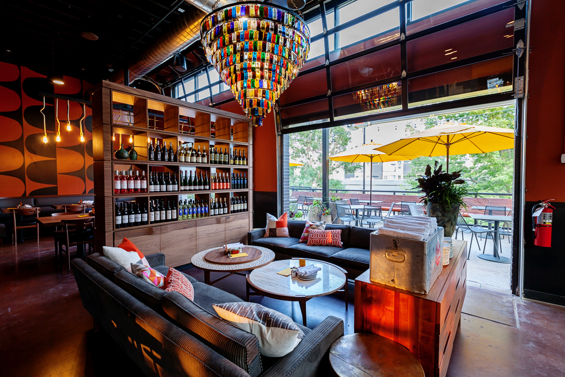
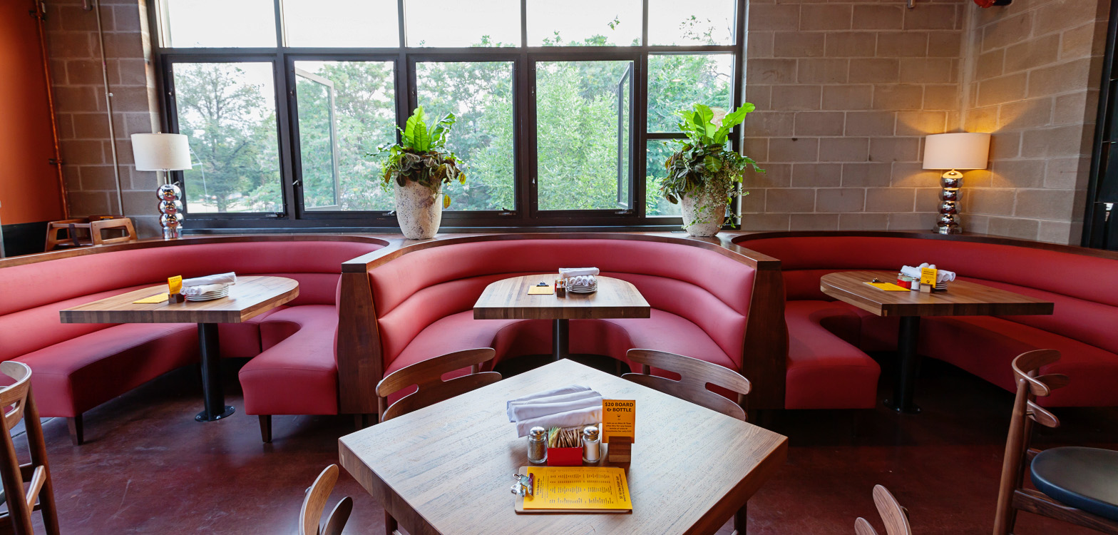
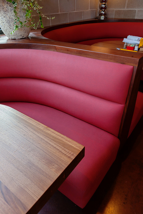
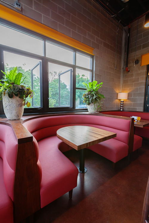
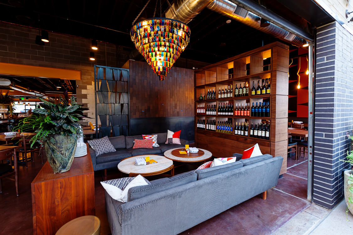
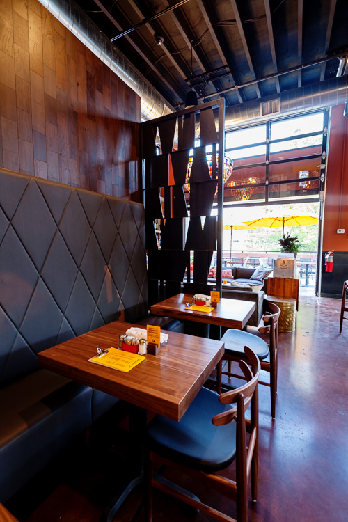
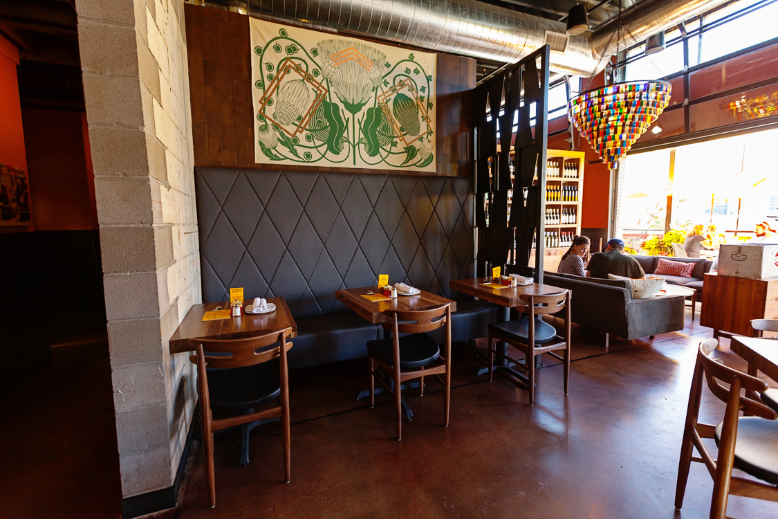
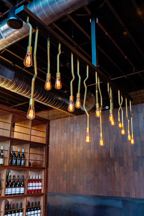
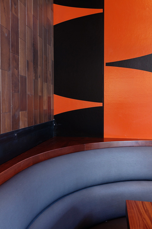
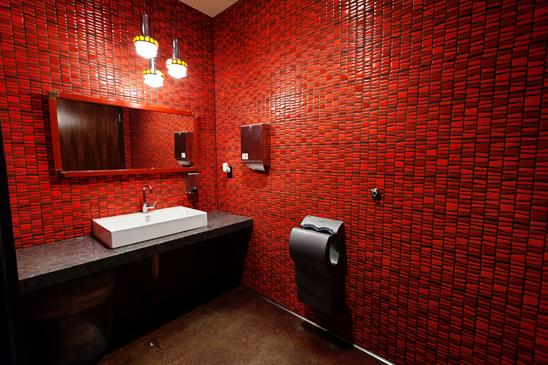
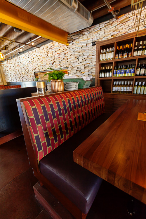
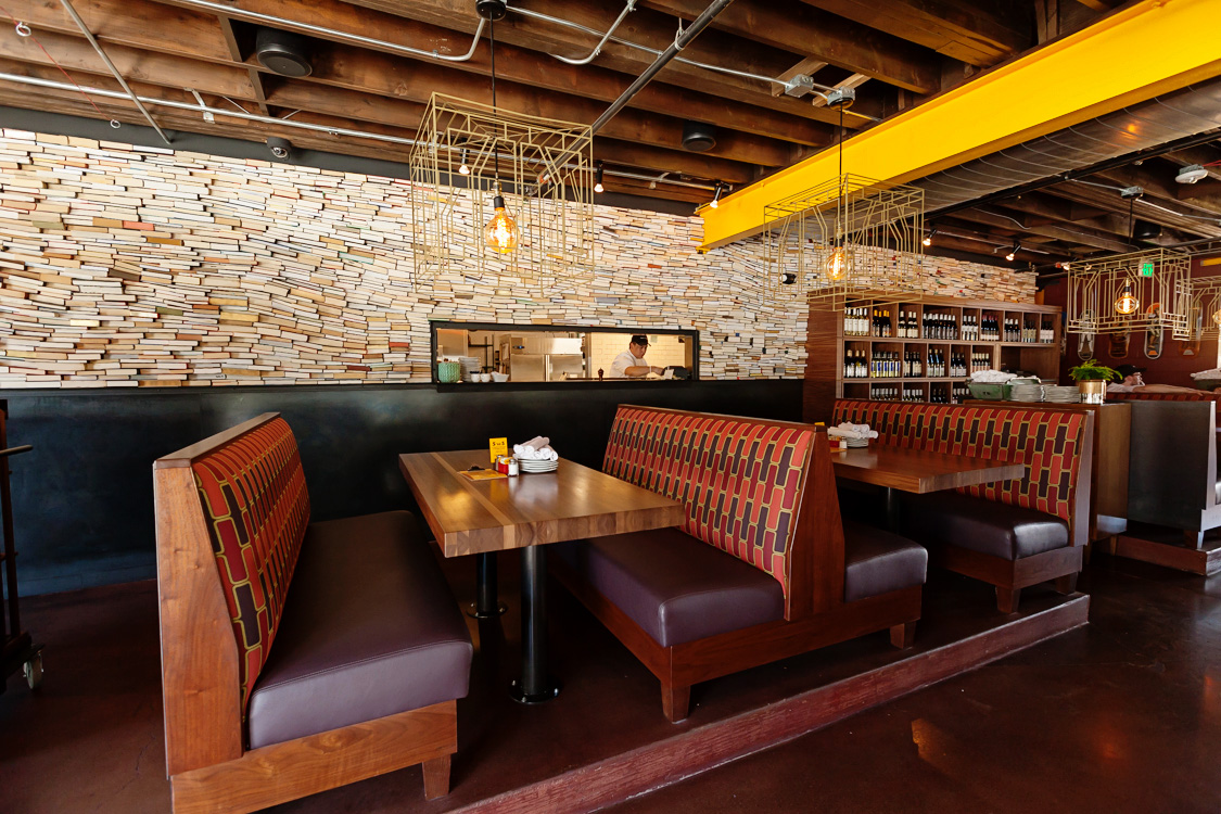
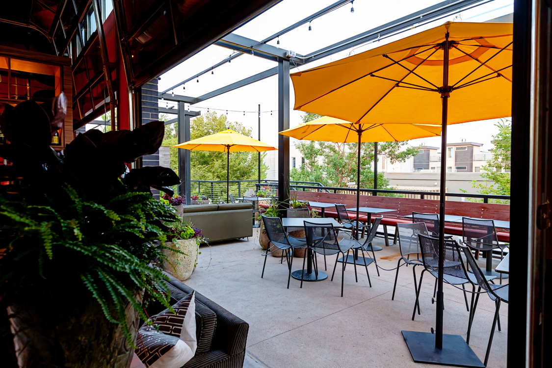
Challenge: Refine and define a well loved brand in a new market. Each authentic Postino location features a fun, funky wall. This old Denver building used to be a book bindery. To create visual and color texture, books were sliced and stacked for its branded feature wall. The restaurant space is a crafted balance of sophistication and colorful whimsy — vintage lighting, bold wallpaper, vintage accessories, and custom walnut millwork throughout. Careful attention was paid to the flow and pace of the space, complete with multiple nooks and types of seating.


“Xan Creative took our design to the next level through a thoughtful, innovative approach. The team kept our original intentions and aesthetic in mind. Their commitment to our project lasted through the construction process and they continue to be a valuable partner to us. They are well rounded and add an incredible amount of value not only in design but also construction, sourcing and budgeting.”
— Lauren Bailey, Upwards Project
